The new Korean

The blue on the new livery is sad. Useless change. The "Pepsi logo" 🇰🇷 is gone. What a shame to see an iconic livery being replace by this joke.

Korean Air can now join the list of airlines that made the wrong move and downgraded their identity these last years with defective new livery:
- Cathay Pacific (2024: too big title)
- Lufthansa (2018: too monotone)
- United Airlines (Evo: too monotone)
- Air India (2023: trash)
- Saudia (2024: trash)
- Emirates (2024: lacks of minimalism)
- …

In opposition to airlines that properly redesigned their colors in the 2010s and 2020s:
- Air France (2021)
- Cathay Pacific (2015)
- KLM (2014)
- American Airlines (2013)
- Hawaiian (2017)
- Alaska Airlines (2016)
- …
How is Evo Blue ‘monotone’? Are we looking at the same livery?
 
Yes we are. Compare it to Continental livery, which has gold, blue, and grey. Evo only has blue and grey
Evo blue has used a variety of shades in its livery (e.g., the halftone gradient on the tail); as far as modern liveries go, it's not dull. UA’s rebrand for its auxiliary products has been neat, too. It's one of the better-executed redesigns, in my opinion.
 
Last edited:
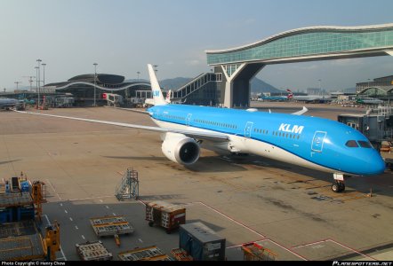
With the Korean Air livery looking like KLM’s, they also changed it. Looks so basic :(
View attachment 41474
They've gotten away with the Crown for KLM Asia planes afaik - if it's a livery change across all KLM planes it's a good step - imo this was long overdue and welcome, considering its inadvertent references to Dutch imperialism.

This won't change the unfortunate legacy of Dutch Imperialist History, but it'll be one step towards acknowledging that it cannot remain as their emblem
 
Last edited:
They've gotten away with the Crown for KLM Asia planes afaik - if it's a livery change across all KLM planes it's a good step - imo this was long overdue and welcome, considering its inadvertent references to Dutch imperialism.

This won't change the unfortunate legacy of Dutch Imperialist History, but it'll be one step towards acknowledging that it cannot remain as their emblem

It's a far stretch to connect this to imperialism. KLM has a crown in its logo because the company was granted the title "Royal" (Koninklijk in Dutch). This honorary title is awarded in the Netherlands to companies or organizations that have existed for at least 100 years or have had significant importance to the country.

Even an internet provider here has that "royal" status.
Yes, exactly my point, you've explained it yourself.

I know what the full form of KLM is since I was 4 or 5 and we'd go to FRA at the time (80s)

Symbols have meaning.

The Netherlands is a functioning democracy, unlike say Saudi Arabia, and it needs to move away from relying upon imagery that is contradictory to that. Especially for its national carrier. JAL doesn't need to rely on imperial imagery, for instance, for it to convey itself.

Those still suffering the consequences of Dutch Colonialism, or any colonialism, , would not want to see imperial imagery brandished in the 21st century on the national carrier of what is now a Free State with an inclusive and progressive social approach to governance.
 
Last edited:
Yes, exactly my point, you've explained it yourself.

I know what the full form of KLM is since I was 4 or 5 and we'd go to FRA at the time (80s)

Symbols have meaning.

The Netherlands is a functioning democracy, unlike say Saudi Arabia, and it needs to move away from relying upon imagery that is contradictory to that. Especially for its national carrier. JAL doesn't need to rely on imperial imagery, for instance, for it to convey itself.

Those still suffering the consequences of Dutch Colonialism, or any colonialism, , would not want to see imperial imagery brandished in the 21st century on the national carrier of what is now a Free State with an inclusive and progressive social approach to governance.
IMO this isn’t imperialism it’s national pride, as the Netherlands has a royal family.
 
IMO this isn’t imperialism it’s national pride, as the Netherlands has a royal family.
I tend to agree we shouldn’t read too much into some of these symbols, a lot of which are not intended to project colonial power. By analogy, should British Airways and Virgin Atlantic stop flying the Union Jack into India, as they do many times a day? To Indians, this was a prominent symbol of their colonialism, after all, as it literally flew over Delhi, Calcutta, Bombay and Madras until 1947. In the Dutch case, the connection is more tenuous; their colonial projects mostly predated the monarchy itself, during the period of the Dutch Republic. Colonialism is a painful memory for a lot of people, and we won’t erase it just by changing a few symbols.
 
Top