swagninja84
Well-known member
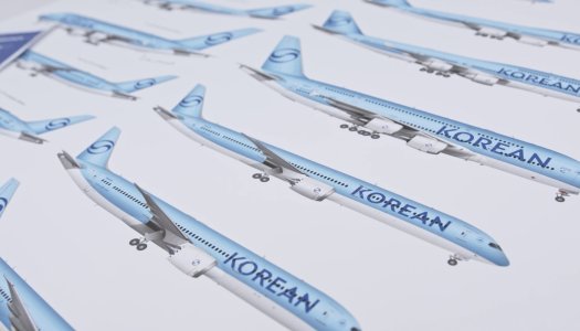
It looks like only one side was painted.The paintscheme on the nose seems mismatched
It looks like only one side was painted.The paintscheme on the nose seems mismatched
Both winglets have the new scheme thoughIt looks like only one side was painted.
It looks like only one side was painted.
Both winglets have the new scheme though

Yep.. I can firmly say the scheme definitely works better - looks 'more complete' - with winglets.I don't dislike it, and arguably, the scheme works better if there are winglets - just adding that little bit but much needed extra colour -
Yes. Korean airlines seem to have a thing for that - Jin, Air Busan, and of course the former silver stripe on KALBut TUI has a solid blue, this is mica. Doesn't necessarily make it better though.

Why is it crooked the paint at the nose.. that is just horrendousA330
Still painted with the old colors on the right side.Why is it crooked the paint at the nose.. that is just horrendous
Still painted with the old colors on the right side.
and the old scheme have a silver cheatline, so definitely the other side is also in the new livery, but some very weird mismatch happened for sure
I guess the more we'll see it, the less we will dislike it.Concepts on the A380 and 747.
Yes, just noticed that.Doesn't make sense! See my earlier post:
I guess the more we'll see it, the less we will dislike it.
So why don’t they finish itStill painted with the old colors on the right side.
 ..
..EDITED:After all those years and i'm still waiting to see Lufthansa, JAL, Iberia, Finnair (and some others) to "grow on me"... nah, I just hate when brands go minimalist
) is gone. What a shame to see an iconic livery being replace by this joke.
Worked for me for the Lufthansa and Evo United. This to the degree that I really came to like the United a lot and collected now more than I have reason to based on my usual criteria and am still tempted on regular basis to add more.I guess the more we'll see it, the less we will dislike it.
Familiarity bias works both ways
So disappointed to see Korean Air going with this awful livery. Add it to the list of updated airline liveries that went bad
China southern
Icelanair
Aer Lingus
Iberia
Lufthansa
Avianca
Air India
Reminds me of the Phoenix attempt at the KLM Orange Pride 77W!The paintscheme on the nose seems mismatched