One of the worst redesigns I've seen... maybe not as bad as Lufthansa IMO but still horribly bad. What a big shame.
You are using an out of date browser. It may not display this or other websites correctly.
You should upgrade or use an alternative browser.
You should upgrade or use an alternative browser.
The new Korean
- Thread starter Travertineeye
- Start date
Travertineeye
Active member
I think this could work well with a larger silver band, curved as in this drawing has it but thicker. And the billboard "Korean" title can fit in silver there in the same proportion to the release. the tail symbol, could still work for me without the red, which is a color you don't see anywhere in Korean's branding but the now 'old' logo. Perhaps the thing I like most about this is the blue compared to the real thing, but now we're talking about a different topic.Some red and contrasting colors for the logo/fuselage would make this somewhat bearable.
View attachment 39357
planes_on_a_shelf
Well-known member
Keen to now see how this looks on a real A359 & 748, and on the A330s.
These are the aircraft types I'd be keen to acquire models of. Current and New Schemes
NG are you listening?
These are the aircraft types I'd be keen to acquire models of. Current and New Schemes
NG are you listening?
The new livery may have worked better if there was a bold line between the white underbelly of the fuselage and the light blue. There isn’t enough contrast as it is.
It might have been better if they pulled a United - just kept Asiana’s livery and slapped “Korean Air” titles on it.
It might have been better if they pulled a United - just kept Asiana’s livery and slapped “Korean Air” titles on it.
Last edited:
Boeing_3019
Well-known member
Looks terrible, always loved the silver line across its fuselage
bakejobb_23
Well-known member
I feel like this might have been said for many years now…but when do we all think the scales tip back to things being “fun” again with more colors and creativity? things such as livery’s and even standard “fast food” buildings and such. I truly hope we do not have to endure it much longer because it gets stale very fast.
boeing737sjcboy
Active member
Yes I meant China Eastern. Thank youYou mean China Eastern


would be much better if they had kept the colors (red, white and blue) in their logo. A silver band separating the blue from the white belly would also be a nice touch. I'm OK with the font used for the "Korean" titles. Anyway... shame to see a beautiful livery ruined!!!
Ugh this is terrible. @pons399 will you still collect Koreans wearing the new livery?
pons399
Well-known member
As much as I hate to admit it, probably yes. KAL’s my most frequented airline, and quality models are few and far between as is. I just hope this dumpster fire spurs mad demand for models in the old liveryUgh this is terrible. @pons399 will you still collect Koreans wearing the new livery?

Last edited:
planes_on_a_shelf
Well-known member
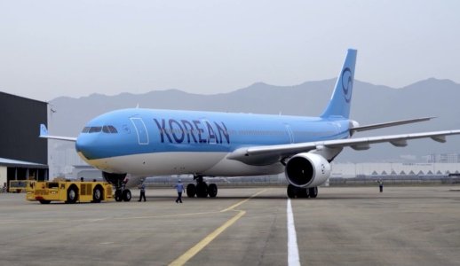
This looks worse in full light, than in the famed night shots of its first sighting
It looks like a Neos NTU 787 which was stored in VCV for over 4 years and now ended up in a new South Korean charter/low-cost airline called "Korean Airways", not at all associated with the famous carrier Korean Air. 
Last edited:
pons399
Well-known member
TUI from Temu, just without any point colors.It looks like a Neos NTU 787 which was stored in VCV for over 4 years and now ended up in a new South Korean charter/low-cost airline called "Korean Airways", not at all associated with the famous carrier Korean Air.
JJ Skippy
Well-known member
Hot take - I am starting to like this new livery. I think it could use a little more color though, but after seeing the titles and logo as a darker shade of blue, rather than closer to black as depicted in the nighttime photos that initially surfaced, I’m favoring this some more now.

Similar threads
- Replies
- 23
- Views
- 1K
- Replies
- 4
- Views
- 430
- Replies
- 40
- Views
- 2K