Retooled nose (?) 747-8i blank by NG Models

Phantom

Well-known member
As I previousely mentioned here, NG's recently delivered 747-8i blank model has a noticeable different cockpit section. I already wondered about when I saw the photos on NG's page, but now I can confirm my copy is very different as well.

As I haven't seen any discussion on this, here are some quick GIFs showing the differences.
All 748i so far had a badly shaped cockpit section with lots of kinks and edges. This blank now sports much smoother outlines.
Though I'm really not sure which one to prefer. They look very different, but I can't decide on which one's more off...

So, is this "blank" the "new" NG 748i?
c by Alexander Kern, auf Flickr
b by Alexander Kern, auf Flickr
d by Alexander Kern, auf Flickr
e by Alexander Kern, auf Flickr
 
As I previousely mentioned here, NG's recently delivered 747-8i blank model has a noticeable different cockpit section. I already wondered about when I saw the photos on NG's page, but now I can confirm my copy is very different as well.

As I haven't seen any discussion on this, here are some quick GIFs showing the differences.
All 748i so far had a badly shaped cockpit section with lots of kinks and edges. This blank now sports much smoother outlines.
Though I'm really not sure which one to prefer. They look very different, but I can't decide on which one's more off...

So, is this "blank" the "new" NG 748i?
c by Alexander Kern, auf Flickr
b by Alexander Kern, auf Flickr
d by Alexander Kern, auf Flickr
e by Alexander Kern, auf Flickr
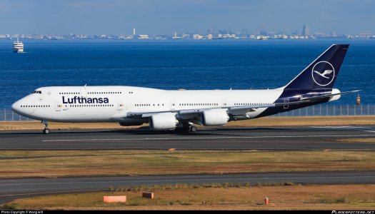
Am I the only one to prefer the LH shape?
 
I think the new version is better in some ways, but something still seems a little off, perhaps the forehead is too flat now. Need to see a comparison with the real thing.
 
These are great references to compare the two @Phantom
I'd say, the 'Lufthansa' one is more '747-ey' and as close to the real thing as we've gotten
The cockpit printing as well is very good - though the 'nose tip / funnel' can probably be softened / straightened / lowered a little but very very little - doesn't really bother me with how it currently is I must say - as any tweaking will probably destroy the close-to-correctness?

The blank (new?) version, looks too 'compressed' and too 'snout-like' - not unlike the JC or the YY ones - with too shallow and rounded a forehead, and not enough gap between the cockpit and the turn down to the nose.

Similarly, the more erect 'nose up' stature - which is more correct in the Lufthansa
The new blank form is uncomfortably too much like the HX/YY one?
 
Last edited:
I may have a theory on why they did this: They ultimately corrected the 747 classic nose shape and now they want to standardize this "brand-new" nose shape (which we are seeing here) for EVERY 747 iteration. This also means that we will see the -200 and -400 versions sooner than later.
 
Last edited:
I may have a theory on why they did this: They ultimately corrected the 747 classic nose shape and now they want to standardize this "brand-new" nose shape (which we are seeing here) for EVERY 747 iteration. This also means that we will see the -200 and -400 versions sooner than later.
Which is a problem, because the 748 has a modified front as well
 
this photo below illustrates my points I'd say, and why the 'Lufthansa' version in the GIFs above is really really close to the real thing,

the blank 747-8i - if that's a modification for the future - is really problematic

View attachment 35134
Side on the "old" shape (LH) is a lot better indeed. Still there's something my eyes absolutely don't like from most other angles.
The main reason I ordered the blank was to strip it and to apply my own decal artwork just to check if it really is just the artwork on the NG (it VERY often really is on these models!)
Well, there goes a plan..
 
These are great references to compare the two @Phantom
I'd say, the 'Lufthansa' one is more '747-ey' and as close to the real thing as we've gotten
The cockpit printing as well is very good - though the 'nose tip / funnel' can probably be softened / straightened / lowered a little but very very little - doesn't really bother me with how it currently is I must say - as any tweaking will probably destroy the close-to-correctness?

The blank (new?) version, looks too 'compressed' and too 'snout-like' - not unlike the JC or the YY ones - with too shallow and rounded a forehead, and not enough gap between the cockpit and the turn down to the nose.

Similarly, the more erect 'nose up' stature - which is more correct in the Lufthansa
The new blank form is uncomfortably too much like the HX/YY one?
I agree with you. The new blank looks more like JC and YY version, which is bad. I hope they recorrect it before the next 747-8s
 
Side on the "old" shape (LH) is a lot better indeed. Still there's something my eyes absolutely don't like from most other angles.
The main reason I ordered the blank was to strip it and to apply my own decal artwork just to check if it really is just the artwork on the NG (it VERY often really is on these models!)
Well, there goes a plan..

I'll second that. Overall I prefer the new version. The side view of the orginal mould was more authentic though.
 
It looks like they made the nosecone more apparent, as well as the door hinges. Also, the engine has a lot more details.
What is also noticeable is that there are more static ports added and they are smaller.

@Phantom could you maybe photograph the underside of the new mould sample?
 
Last edited:
It looks like they made the nosecone more apparent, as well as the door hinges. Also, the engine has a lot more details.
What is also noticeable is that there are more static ports added and they are smaller.

@Phantom could you maybe photograph the underside of the new mould sample?
Yes, but all of these details aren't mould related. The underside as well as the rest shows no difference mould wise.
 
I'll second that. Overall I prefer the new version. The side view of the orginal mould was more authentic though.
Curious to see what the next "regular" release will look like.

The more I'm looking at this the more I think I understand what might be the issue (with both variants): the windshield is moulded too wide with an almost flat center area inbetween the windshield wipers which shouldn't be there.
 
Top