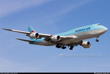
The new Korean

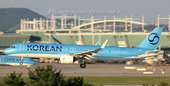
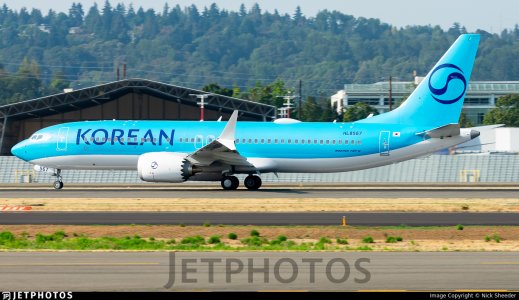
I would be really curious to see Korean Air new livery with my eyes. It is not just light blue but it seems there is a bit of "opal" color. The livery seems to change depending on how the sun's rays hit the fuselage.
This livery (still not sure if i like it or not)remembers be latest Alitalia livery, a light grey changing shde with sunlight.
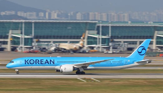
The issue is not even the blue itself but the fact that there is no colored "pepsi" logo anymore. That logo, which represent the korean flag, may be the most important element of Korean Air. Now they removed it, it just became a boring monotone generic livery that makes no sense, whether you like it or not.
 
but right now it just looks like a cosmetics company to me
THIS!
Very apt Hehe

I'm not against the new livery. I guess it's grown on me. Familiarity, perhaps.

But I will sorely miss the previous scheme, just like I miss the 'old' LH........

I guess only Condor really got it right with their rebrand. Everything else is just corporate slop.
 
I guess only Condor really got it right with their rebrand. Everything else is just corporate slop.
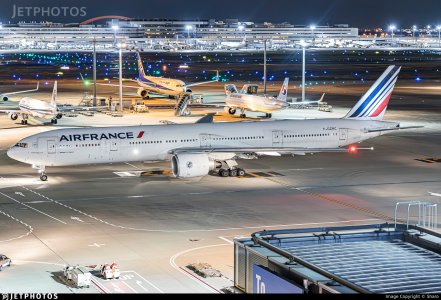
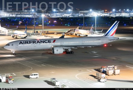
Air France got it right too! Definitely the best transition of the last 5 years. All they did was to re-size the title (which was necessary, especially their A320), re-organized the AF-KLM logo, skyteam, etc. and that’s it! They didn’t change their emblematic logo or the french colors from their aircrafts. The AF identity hasn’t disappear and that’s why, even though I still love the 2009 livery on their 77W, I think the current colors is the perfect upgrade AF needed.
IMG_9780.jpeg
IMG_9777.jpeg
 
Air France got it right too! Definitely the best transition of the last 5 years. All they did was to re-size the title (which was necessary, especially their A320), re-organized the AF-KLM logo, skyteam, etc. and that’s it! They didn’t change their emblematic logo or the french colors from their aircrafts. The AF identity hasn’t disappear and that’s why, even though I still love the 2009 livery on their 77W, I think the current colors is the perfect upgrade AF needed.
View attachment 47595
View attachment 47596

BRO! 😎 My favorite contemporary livery and I applaud Air France for keeping it tastefully updated.
 
Still crappy no matter what aircraft wears it!

But then this old livery (taken today) can look at least as crappy I'd say.
I heard this poor 380 screaming down the glide path: "help! Paint me! Paint me!! Please!!"
What a mess. 🫣 😅
120925_hl7619a.png
 
Last edited:
Oh, but that's just a worn out paint. She needs a touch-up indeed! But the livery itself is much better than the new one! :D
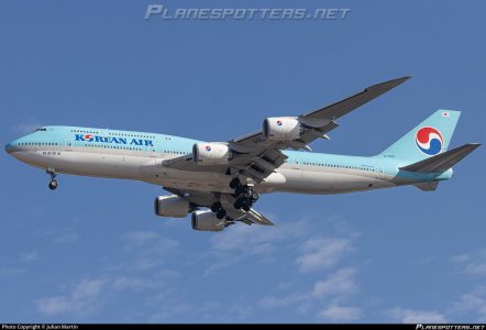
Some of the 748s are looking kind of bad too, but not this bad wow. I have a shot of HL7637 in March and she was looking rough, but HL7638 was quite clean before she got repainted (I'm pretty sure I have one of the last if not the last photo of it in old colors). I'm not sure if any other 748s will be repainted because they appear to be done by years end.
 

Attachments

  • hl7638-korean-air-boeing-747-8b5_PlanespottersNet_1752742_4450a0ad12_o.jpg
    hl7638-korean-air-boeing-747-8b5_PlanespottersNet_1752742_4450a0ad12_o.jpg
    109.5 KB · Views: 10
  • hl7637-korean-air-boeing-747-8b5_PlanespottersNet_1760466_3dda843413_o.jpg
    hl7637-korean-air-boeing-747-8b5_PlanespottersNet_1760466_3dda843413_o.jpg
    98.9 KB · Views: 10
Top