Charter
Well-known member
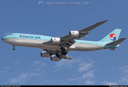
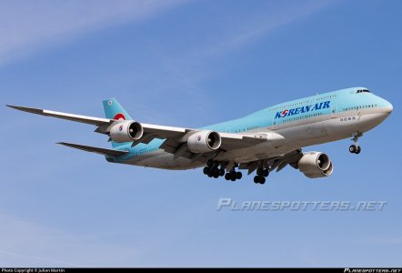
I would be really curious to see Korean Air new livery with my eyes. It is not just light blue but it seems there is a bit of "opal" color. The livery seems to change depending on how the sun's rays hit the fuselage.
This livery (still not sure if i like it or not)remembers be latest Alitalia livery, a light grey changing shde with sunlight.
This livery (still not sure if i like it or not)remembers be latest Alitalia livery, a light grey changing shde with sunlight.


 My favorite contemporary livery and I applaud Air France for keeping it tastefully updated.