planes_on_a_shelf
Well-known member
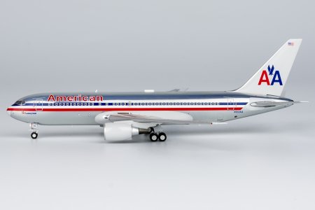
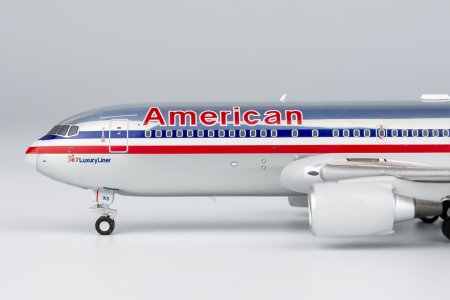
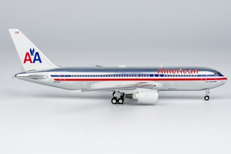
this isn't surprising (Disclaimer: some nerdy stuff incoming lol - courtesy me being a design educator)- and in many ways can be traced down to a legacy of reductive design in the EU / West - now being also followed by business and branding - which has roots in the 1800s flawed revisionism where (in reality) colourful Greek temples were presented as 'pristine, pure, white' (refer Victorian Revivalism) - which leads to the European Modernist ideal of the monochrome white and then to Corporate Modernism - blue,greys,whites,blacks (this is a very very very abridged summarisation). Thus the 'over-corporatisation' of the industry means that more and more airlines prefer to stick to the generic and mundane - and thus the lack of 'bold' and 'distinctive' schemes - or their gradual disappearance as airlines became less individual-driven, and more corporation driven - especially amongst larger / mainline carriers. Which is why it is so refreshing that Condor went rogue with their bold and yet pretty minimal scheme. And which is why so many 'Westerners' hate it lol - it's too 'colourful and 'in-your face'. I find these reactions very similiar to the British colonisers who hated the polychromatic South Indian temples referring to them as gaudy and 'unrefined' and mark of a 'backward' culture lol - the association of too much colour, with something that is regressive and primitive and vulgar and vile (gaudy is actually a derisive term) has colonial origins thus . Unfortunately, in our post-global world, these flawed 'modernist' colonial value systems have travelled east and south across the world.Gemini Jets recently did a Q&A and they actually explained their sales data reflects Chinese buyers purchase more special liveries whereas Western buyers prefer normal liveries. Explains why NG targets special liveries with Chinese airlines but usually releases regular liveries with European/US airlines.
Which is why Pride Month is so refreshing - to see so much colour out in the open!

Last edited: