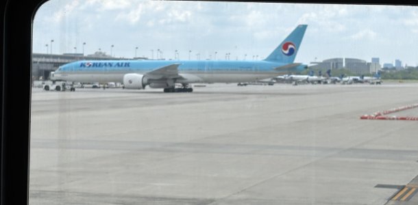
The new Korean

I tend to agree we shouldn’t read too much into some of these symbols, a lot of which are not intended to project colonial power. By analogy, should British Airways and Virgin Atlantic stop flying the Union Jack into India, as they do many times a day? To Indians, this was a prominent symbol of their colonialism, after all, as it literally flew over Delhi, Calcutta, Bombay and Madras until 1947. In the Dutch case, the connection is more tenuous; their colonial projects mostly predated the monarchy itself, during the period of the Dutch Republic. Colonialism is a painful memory for a lot of people, and we won’t erase it just by changing a few symbols.
But even the Union Jack, it’s just a flag, and I don’t think it conveys too much colonialism in the new liveries
 
But even the Union Jack, it’s just a flag, and I don’t think it conveys too much colonialism in the new liveries
By the same logic, KLM’s crown is just a crown - that’s the point I was trying to make. There are limits, though, such as if, say, Lufthansa were to adopt a swastika or black cross as their logo. Everyone would know what that meant. South African Airways removed the Orange and Blue, as well as the Afrikaans titles, from their livery for similar reasons.
 
Yes, exactly my point, you've explained it yourself.

I know what the full form of KLM is since I was 4 or 5 and we'd go to FRA at the time (80s)

Symbols have meaning.

The Netherlands is a functioning democracy, unlike say Saudi Arabia, and it needs to move away from relying upon imagery that is contradictory to that. Especially for its national carrier. JAL doesn't need to rely on imperial imagery, for instance, for it to convey itself.

Those still suffering the consequences of Dutch Colonialism, or any colonialism, , would not want to see imperial imagery brandished in the 21st century on the national carrier of what is now a Free State with an inclusive and progressive social approach to governance.

The crown symbol represents multiple things depending on the context. And in this case it represents prestige.

The Dutch were already involed in imperialism before we even got a king. So to say that a crown always reflects imperial imagery is not true.

And by your logic, what is the end of this? National flags are symbols, even names like "American" could be symbols in a broader sense. And those can be offensive too depending on who you ask.

NG has some nice blank models maybe that is the solution? ;)
 
There are some nice photos on airliners.net and other places. The livery might not be the same but for me it works like no other with the entirety of the livery in metallic sheen. It’s almost like silk, a luxury, and inspiration for the airline to become just that in service.
Hope NG makes those models soon. Three types so far.
Yep, I agree - that overall metallic sheen (love your silk analogy - perfect!), and the crispness of the font and the monochrome Taegeuk on the tail and engines - I assume plays a big role in why the scheme's growing on me - the sheen adds that sense of 'prestige' a bow to the metallic silver on the previous scheme. I do miss the red accent - but yeah I guess, just like with LH's missing yellow, I'll get used to its absence.

This scheme looks great on the long 78X and 77W.
Waiting to see how it'll look on the A330s & A350s.

Not convinced though of how it's on the 748 - I hope there's some rethink - so also with the A380s.
 
Top