Everyone's Favourite Livery

YesterAirlines

Moderator
Staff member
It's been rather slim pickings from the recent release sets but this pair of NG's just arrived in everyone's favourite livery. I know it gets a lot of stick but I prefer the swallow and typeface to the crane and typeface on the JAL scheme myself. Anyway important couple of fleetbuilders for my collection.
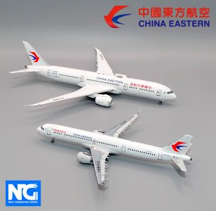
MU_NGPair.jpg

This is also the first ever release of a China Eastern 787-9 as prior to this all were in the colours of their large subsidiary China Eastern Yunnan (livery wise I admit that just amounted to Yunnan titles in Chinese). China Eastern Yunnan have flown 787s since November 2018 and have three in the fleet (B-206K, B-208P and B-209N). B-226Q is the first of the type to operate with the parent and arrived only in February. Until now China Eastern's long-haul fleet has been centred around 777s and A350s.
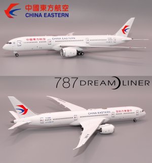
B-226Q.jpg
 
I always find it fascinating to see how airlines from non English speaking parts of the world decide to write their name on their planes. Do they use they use their native language/alphabet, or do they forgo it to use only english? I find it visually interesting to see both here on the China Eastern. I really liked the old Landor livery on Asiana in part for this same reason. I wonder how airlines decide to handle this question.
 
I always find it fascinating to see how airlines from non English speaking parts of the world decide to write their name on their planes. Do they use they use their native language/alphabet, or do they forgo it to use only english? I find it visually interesting to see both here on the China Eastern. I really liked the old Landor livery on Asiana in part for this same reason. I wonder how airlines decide to handle this question.
Most Chinese airlines have the titles in both languages..
It's a good and pertinent insight you have here - as more and more airlines shift to only English on their titles.
Needless to say, both languages are desirable imo - to provide that necessary cultural marker and uniqueness.
But with more and more airlines adopting a universal corporate minimalism (eg. Korean), or a 'global airline' approach - we're loosing that
Like the new AI livery - which is the other extreme from the Korean 😂 - maximalist vs minimalist - but it only has titles sadly in English. The previous, thick, stretched, italicised titles were so sleek imo.
 
in everyone's favourite livery.
🤣🤣🤣
I personally prefer the JAL though - as it's visually pleasing, even more so on the A350s with the red winglets, and with the 'Rising Sun' Tsurumaru and the large, stretched, italicised titles

On the MU - the chosen red and blue contrast in a very jarring way. And the logo, without a defined geometric outline sits very uncomfortably, especially in light of the unpleasant contrast
 
Last edited:
I like when airlines write their names in English and in their native language too. This was quite common among Russian airlines. Some had titles in English in one side and cyrillic writing on the other. Defunct Russian airline Transaero is a good example of this.

About China Eastern: THIS was their good scheme 🥰 and I prefer JAL too over the current China Eastern scheme, although both are horribly boring. JAL did a wonderful thing when they brought back the Tsurumaru logo - they just forgot to bring back a livery with it!
 
Most Chinese airlines have the titles in both languages..
It's a good and pertinent insight you have here - as more and more airlines shift to only English on their titles.
Needless to say, both languages are desirable imo - to provide that necessary cultural marker and uniqueness.
But with more and more airlines adopting a universal corporate minimalism (eg. Korean), or a 'global airline' approach - we're loosing that
When doing a universal corporate minimalism, I wonder if it is more for global brand recognition and less for local banding purposes? In this model for example, is it that there is a greater difference between Chinese and English, or is there more need to differentiate the brand among local competition? Regardless, i find this China Eastern livery to be a little stark, but I do appreciate the dual languages!
I like when airlines write their names in English and in their native language too. This was quite common among Russian airlines. Some had titles in English in one side and cyrillic writing on the other. Defunct Russian airline Transaero is a good example of this.
Yes, having both languages on each side is interesting. KLM uses the English name (despite the acronym coming from Dutch). But their “named” planes have the English name on one side and the Dutch name on the other. For example PH-BHO is “Orchidee” or Orchid". But this is subtle.
 
Last edited:
No recent releases, but my favorites are still Xiamen Airlines and ANA, I seem to have a love for the color blue, ANA started me on civilian airliners because of Takuya Kimura's TV series, Xiamen Airlines is my hometown airline, and it just so happens that I really like the color blue, and I love both, can't tell them apart from each other, followed by Air China and Delta Air Lines!
 
Call me biased but I absolutely adore SAS' new livery, I think it captures Scandinavian design brilliantly. The matte silver and the navy blue gives off a very alluring arctic feeling and I love how the SAS titles are integrated into the matte silver. My favourite part of the livery is how they blended the three Scandinavian flags to a colourful motif in a minimalistic manner that doesn't disturb the rest of the livery.
 
China Eastern current livery is awful. No matter what plane you put it on

Right.
With special schemes, it sometimes works.
The current Harbin pair though look great and the colours work with the red and blue titles. . Just not a fan of the super large English lettering obscuring the lovely layered artwork - especially on the A332.
 
Any form of eurowhite is pure cancer. Even the more colorful ones (i.e. Asiana) are hideous.

I’m a stickler for retro cheatline liveries like SQ and KE, classy with lots of character. More minimalist interpretations of that (CX), or colorful ones with unique patterns (EY) are great as well.
 
Any form of eurowhite is pure cancer. Even the more colorful ones (i.e. Asiana) are hideous.

I’m a stickler for retro cheatline liveries like SQ and KE, classy with lots of character. More minimalist interpretations of that (CX), or colorful ones with unique patterns (EY) are great as well.

Eurowhite was nice when it was first unveiled back in the 1970s/1980s because they stood out.
I bet it was cool to see a pure white Air France, SAS or even Transbrasil planes back in the day. But nowadays, eurowhite have become the norm and airlines are stretching it too much and getting rid of color for good. In a not so dystopian future, I guess every airline will have a white tube with wings and a name written on it. That's exactly how I see JAL, China Eastern, Finnair... there is no class, no effort, just a white tube and a name.

Lufthansa may be the biggest offender of this..
 
Top