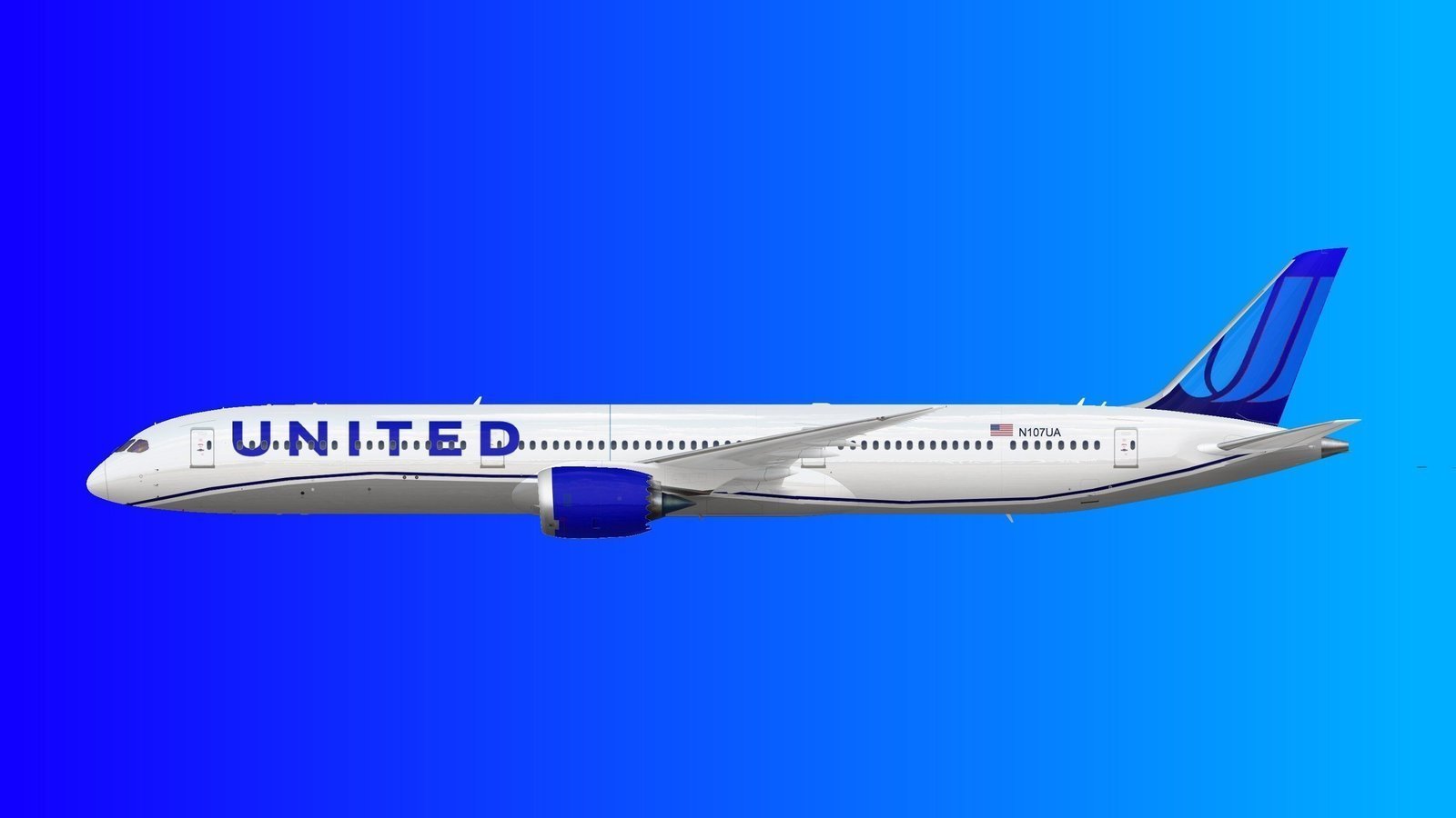
Does United have any plans to phase out their merger livery anytime soon? These planes look so nice, especially when side by side with their modern blue counterparts. The variety brings out so much uniqueness to the fleet, and it would be sad to see these all repainted one day!
You are using an out of date browser. It may not display this or other websites correctly.
You should upgrade or use an alternative browser.
You should upgrade or use an alternative browser.
United Livery
- Thread starter ghqv2988
- Start date
B767Avia
Well-known member
Hopefully they will keep some in the CO merger livery, they do have a Stars and Bars and an old CO livery as heritage liveries, so it all makes sense. While my personal preference is the Evo Blue, it's sad to see the merger livery go.Does United have any plans to phase out their merger livery anytime soon? These planes look so nice, especially when side by side with their modern blue counterparts. The variety brings out so much uniqueness to the fleet, and it would be sad to see these all repainted one day!
Purpleplane
Well-known member
I really hope that sometime in the future United will adopt a new color scheme that somehow features the "Tulip" that appeared on the tail from the Saul Bass, battleship gray, and the "Blue tulip" schemes up until the Continental merger. Although the "evo blue" isn't bad, it would be awesome with the tulip sitting prominently on the tail.
planes_on_a_shelf
Well-known member
I really hope a 787 is painted in the heritage Saul Bass scheme.

OscarBravo992
Well-known member
I have mixed views on this. I really like Evo Blue, but I miss seeing the Tulip on UA tails. I think they need to shed or at least lessen the Continental look so that the old UA can shine through.
I found this image online, and I think it fits. I feel it sort of pays homage to the final pre-merger livery as well as acknowledging Evo Blue and CO at the same time:
I found this image online, and I think it fits. I feel it sort of pays homage to the final pre-merger livery as well as acknowledging Evo Blue and CO at the same time:
Purpleplane
Well-known member
It would be great if they used that one.I have mixed views on this. I really like Evo Blue, but I miss seeing the Tulip on UA tails. I think they need to shed or at least lessen the Continental look so that the old UA can shine through.
I found this image online, and I think it fits. I feel it sort of pays homage to the final pre-merger livery as well as acknowledging Evo Blue and CO at the same time:
Aviation Enjoyer
Well-known member
This might actually work very well on UAL aircraft. Maybe some signs of good friendship on the plane too.I have mixed views on this. I really like Evo Blue, but I miss seeing the Tulip on UA tails. I think they need to shed or at least lessen the Continental look so that the old UA can shine through.
I found this image online, and I think it fits. I feel it sort of pays homage to the final pre-merger livery as well as acknowledging Evo Blue and CO at the same time:
Alzyerpal
Well-known member
Mind you it's always been important to reflect the brandings of both airlines since the merger in 2010 and I think that was decided upon so that it didn't appear as a takeover, much unlike previous mergers where one airline disappeared effectively (Northwest and TWA).I have mixed views on this. I really like Evo Blue, but I miss seeing the Tulip on UA tails. I think they need to shed or at least lessen the Continental look so that the old UA can shine through.
I found this image online, and I think it fits. I feel it sort of pays homage to the final pre-merger livery as well as acknowledging Evo Blue and CO at the same time:
In this case Continental was the bigger business, but the better known brand was United. Therefore if nowadays a livery associated with a pre-merger United, or elements of are reintroduced, it starts to look like a corporate takeover again ? Maybe something completely original is required with no references to previous days ?
planes_on_a_shelf
Well-known member
Yeah that sounds agreeable and makes one think about the merits of a 'fresh' identity. Just like what the Saul Bass livery did.Mind you it's always been important to reflect the brandings of both airlines since the merger in 2010 and I think that was decided upon so that it didn't appear as a takeover, much unlike previous mergers where one airline disappeared effectively (Northwest and TWA).
In this case Continental was the bigger business, but the better known brand was United. Therefore if nowadays a livery associated with a pre-merger United, or elements of are reintroduced, it starts to look like a corporate takeover again ? Maybe something completely original is required with no references to previous days ?
boeing737sjcboy
Active member
As much as we all feel, the globe is not going anywhere. The Evo blue is great and should have been the livery released at merger time imo. i love the tulip and its United, but as a continental fan i will always have an affection for the globe
Similar threads
- Replies
- 40
- Views
- 3K
- Replies
- 8
- Views
- 470
- Replies
- 0
- Views
- 301