You are using an out of date browser. It may not display this or other websites correctly.
You should upgrade or use an alternative browser.
You should upgrade or use an alternative browser.
NG Models August 2025 Releases
- Thread starter YesterAirlines
- Start date
bakejobb_23
Well-known member
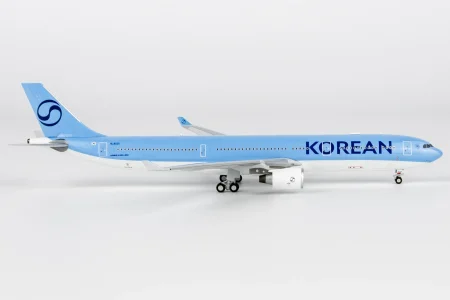
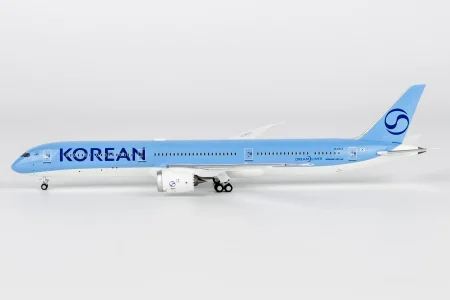
Could be the editing but it seems to tar-heel blue than the korean blue. Might need to be more metallic-y?? like a pearl blue” almost. It’s certainly close but definitely not perfect?
pons399
Well-known member
It’s got the pearl.
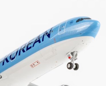
787 looks dead on while 330’s only issue is a slightly misplaced wing reg. Both are miles better than all the uncollectible crap they released in the classic livery. Never wanted to ragequit this hobby more!
Like honestly, they can’t have ONE decent release in the Pepsi scheme, yet nail BOTH Wish.com KLMs right off the bat?? Fml.
Last edited:
bakejobb_23
Well-known member
It’s got the pearl. View attachment 50357
787 looks dead on while 330’s only issue is a slightly misplaced wing reg. Both are miles better than all the uncollectible crap they released in the classic livery. Never wanted to ragequit this hobby more!
I stand corrected, looks fine enough to me on this angle!
swagninja84
Well-known member
What was wrong with the 787-10?Like honestly, they can’t have ONE decent release in the Pepsi scheme,
nat_hat
Active member
Still strongly dislike the new livery but the A330 is a stunning bird that somehow makes it look pretty good
pons399
Well-known member
planes_on_a_shelf
Well-known member
Yep. I'd mentioned this before as well - the A330 wears anything like a pro - a beautiful machine - no livery, no matter how bland and boring, ever looks dull on the A330 !. No wonder it's my fav 2nd generation twinjet, and an all time favStill strongly dislike the new livery but the A330 is a stunning bird that somehow makes it look pretty good
Last edited:
planes_on_a_shelf
Well-known member
On the real thing it's grey as well isn't it?
pons399
Well-known member
It’s bright white, as you can see in the 2nd pic.On the real thing it's grey as well isn't it?
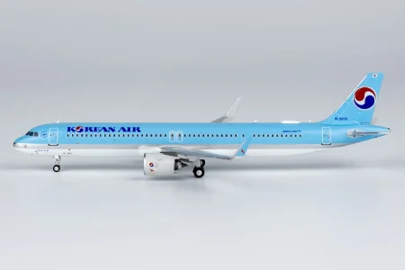
The A321’s and 737 were ok.It’s got the pearl.
787 looks dead on while 330’s only issue is a slightly misplaced wing reg. Both are miles better than all the uncollectible crap they released in the classic livery. Never wanted to ragequit this hobby more!
Like honestly, they can’t have ONE decent release in the Pepsi scheme, yet nail BOTH Wish.com KLMs right off the bat?? Fml.
ChairFlyer101
Well-known member
Untreated but I appreciate NG is darkening the 787 cockpit windows finally. Especially on the older Aie Canada, the windows stood out like a sore thumb against darker liveries.
planes_on_a_shelf
Well-known member
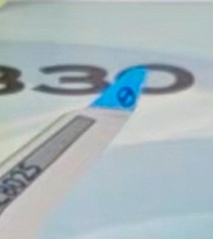
Just going through the pictures and one of the A330 winglets has the logo off centered - hopefully it's only on that one - will know when my copy arrives787 looks dead on while 330’s only issue is a slightly misplaced wing reg.
Though will be unnoticeable I guess to the naked eye
HawaiianAlaskaFan
Member
_KAviation
Active member
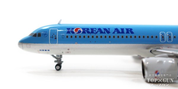
It’s not the first time we’ve seen the logo horizontally compressed on an NG release, I remember the VS A35K they released a few years ago suffered from this issue.View attachment 50435
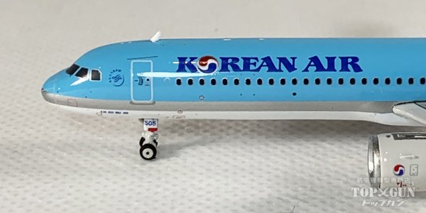
The A321’s logo looks too horizontally compressed. This was also an issue with NG’s KE’s old livery on the B787-10.
This issue was more noticeable compared to the A321 models released by Phoenix and JC.
View attachment 50437
JC
View attachment 50438
Phoenix
JJ Skippy
Well-known member
Delta's logo is also like this on the A319/A320.It’s not the first time we’ve seen the logo horizontally compressed on an NG release, I remember the VS A35K they released a few years ago suffered from this issue.
_KAviation
Active member
The Delta logo on those wasn’t the best, the Korean B748’s also suffer from this.Delta's logo is also like this on the A319/A320.
pons399
Well-known member
Engine logos are the issue with those, fuselage logos look fine.The Delta logo on those wasn’t the best, the Korean B748’s also suffer from this.
pons399
Well-known member
It’s off center on other examples as well. Unfortunately, I can’t find anything wrong with the 787…Just going through the pictures and one of the A330 winglets has the logo off centered - hopefully it's only on that one - will know when my copy arrives.
Though will be unnoticeable I guess to the naked eye
swagninja84
Well-known member
The other side doesn't look that bad.It’s off center on other examples as well. Unfortunately, I can’t find anything wrong with the 787…
View attachment 50740
Similar threads
- Replies
- 142
- Views
- 12K
- Replies
- 28
- Views
- 2K
