Jazajia
Well-known member
Just like it is for many other aviation enthusiasts, the British Airways Landor livery is one of my all-time favorites. This year there has been quite a bit going on in the die-cast world around this iconic livery with a lot of releases and announcements (most of them rather controversial) You can click here if you want to see how the early 2023 Landor 747-100 and -200 released by Phoenix turned out.
On a personal level, one of my first purchases of 2023 put an end to a multi-year hunt for a 1:400 scale British Airways Concorde in the Landor livery (GeminiJets G-BOAB). And as if that wasn’t enough, a few months later I found the only other BA Landor Concorde in 1:400 scale (Herpa G-BOAE).
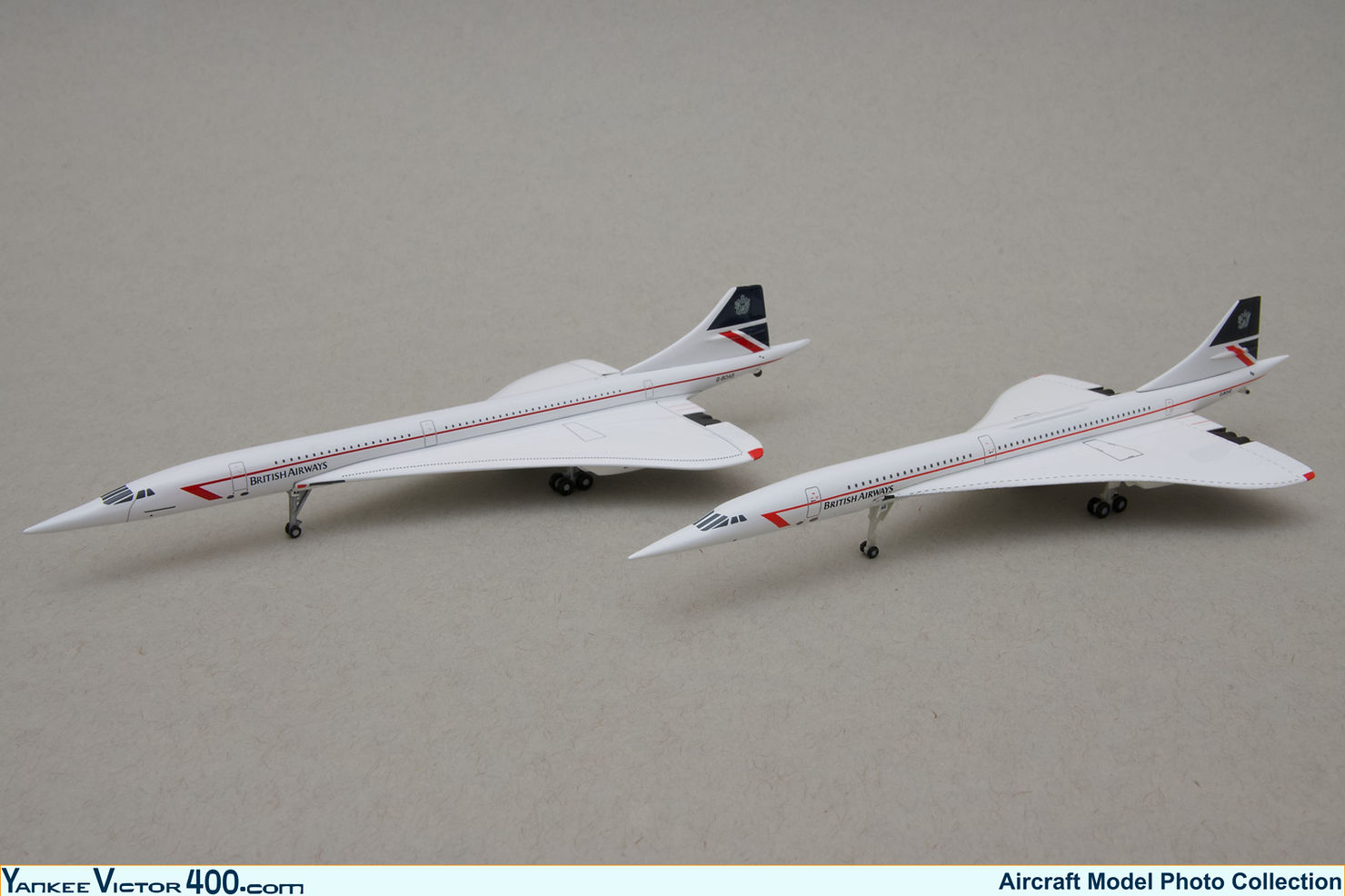
British Airways Aérospatiale/BAC Concorde 102. Left - GeminiJets G-BOAB. Right - Herpa G-BOAE
With all this happening I think it is a good time to share my thoughts on why the British Airways Landor livery is liked so much by many.
His name was Walter Landor, a genius of corporate branding and the creator of Landor Associates (today Landor & Fitch). The company is behind some of the most iconic corporate images around the world. In the commercial aviation industry dozens of flag carriers ow their public image to Landor. But among all of the airlines that have, or have had, the name Landor attached to their liveries and corporate images, British Airways is probably the one that stands out the most.
In 1984 British Airways as we know it today was only ten years old, though its roots can be traced back for about a century, and it was then when the airline resourced to Landor associates in search of a new corporate image.
A few years later, in February 1987 (only a few months before I was born) the airline was privatized, and a rapid growth campaign that was already underway intensified. As a result, I grew up during a time in which British Airways was doing the same and proudly displaying its eye-catching Landor livery and corporate image.
British Airways' Landor livery consisted of a midnight blue belly that extend right up to the bottom of the passenger windows line, where it met with a pearl grey that covered the entire top of the fuselage. Along the midnight blue belly ran a long subtle “brilliant red” line that culminated on the lower forward fuselage with the Speedwing logo. The company titles were located on the upper forward fuselage, just above the passenger windows. The tail design consisted of a quarter of the Union flag with the British Airways Coat of Arms prominently displayed on the top section of it.
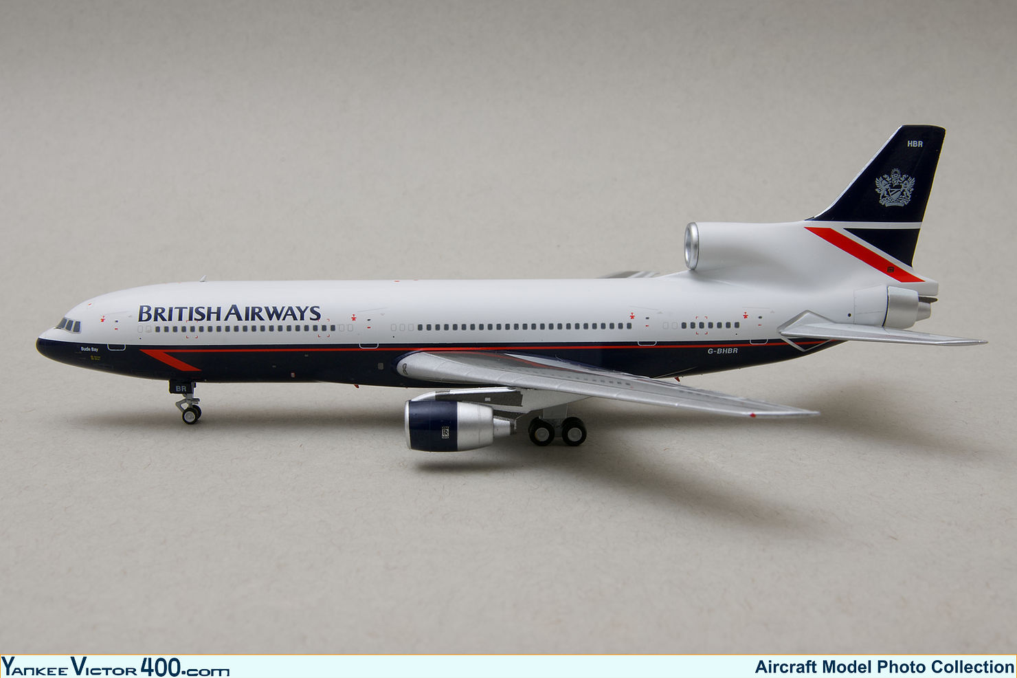
British Airways Lockheed L1011-200 TriStar G-BHBR NG Models 1:400
In spite of the rather dull pearl grey top cover, the contrast with the midnight blue belly, and the accent given by the brilliant red of the Speedwing gave a fresh and lively touch to the otherwise profoundly elegant livery.
The livery seemed to have been tailored for the 747. The aircraft’s main deck window line position in relation to the nose cone was such that the split between the blue belly and grey top cut right through the middle of the radome, making the livery look particularly sharp when applied to the jumbos. The British Airways titles stood prominently, framed by the enlarged forward fuselage area resulting from the jumbo’s upper deck. The livery looked its best on the 747-400, whose longer upper deck allowed the titles to be enlarged.
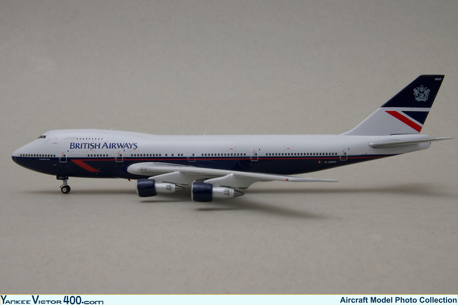
British Airways Boeing 747-136 G-AWNP Phoenix Models 1:400
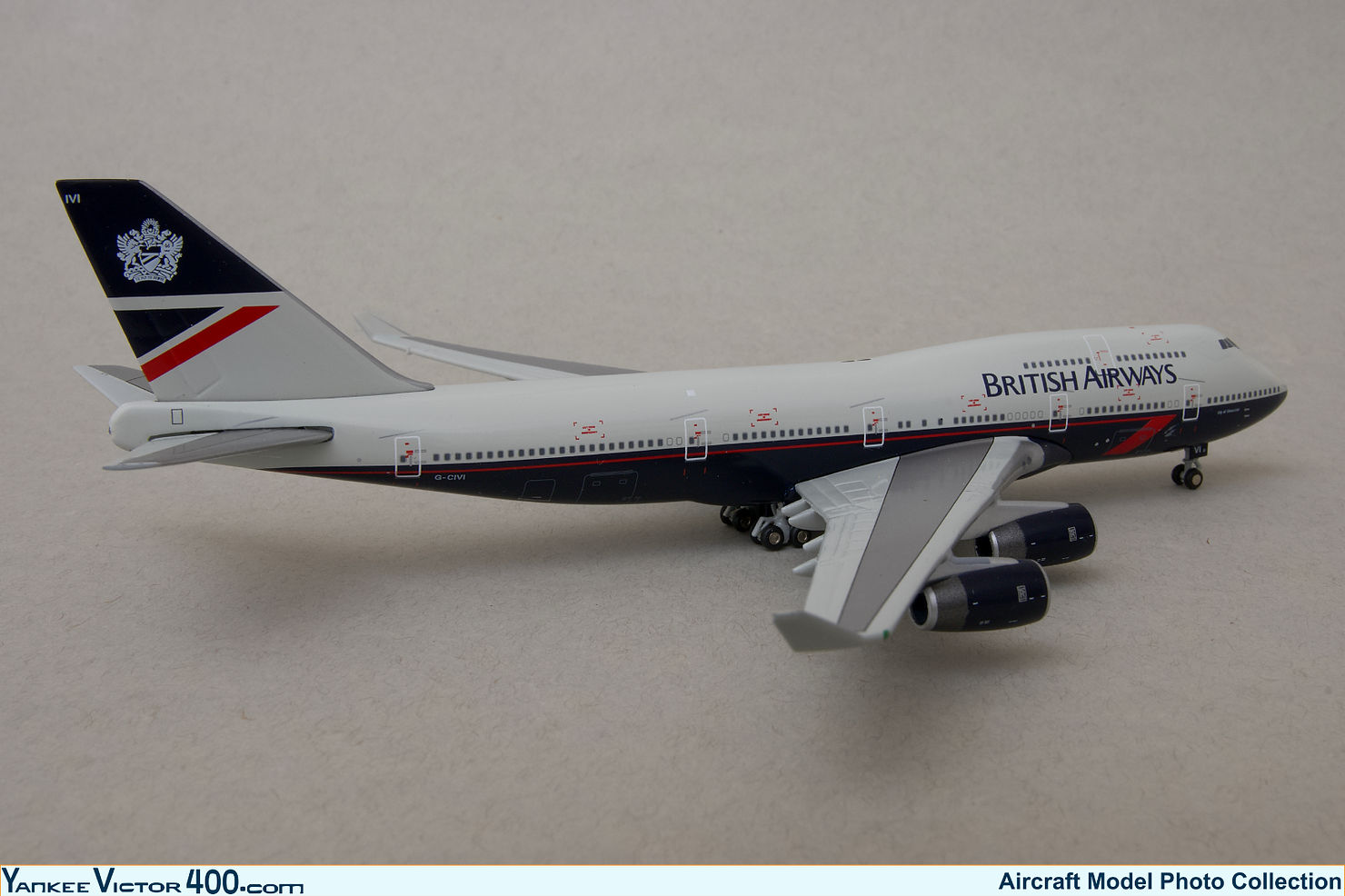
British Airways Boeing 747-436 G-CIVI GeminiJets 1:400
The livery was also well suited for other widebody aircraft, though I have always thought that the #2 engine of the DC-10s did get in the way of the tail artwork. On narrowbody aircraft, while still stylish, the livery didn’t always fit as neatly as it did on the big boys, particularly the 747s.
An exception to this is, of course, Concorde, which due to technical reasons had to wear a mostly white adaptation of the livery that suited the aircraft perfectly. It is by far the best attire that Concorde ever wore.
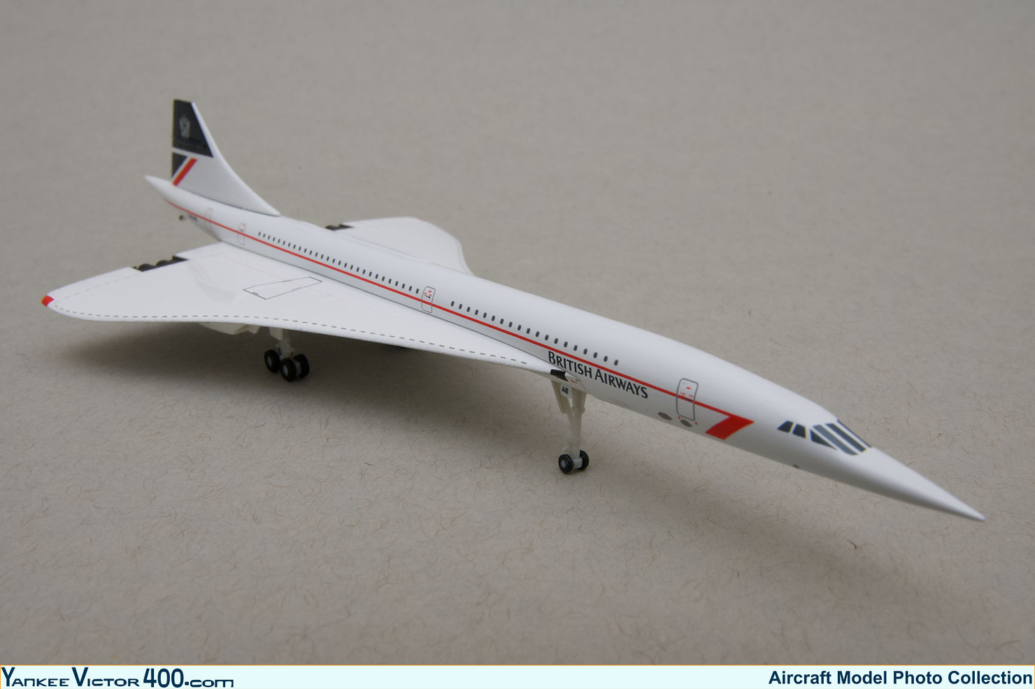
British Airways Aérospatiale/BAC Concorde 102C G-BOAE Herpa 1:400
Luckily, those of us outside of Europe were mostly exposed to British Airways' long-haul fleet, which meant that we got used to seeing the Landor livery displayed on the aircraft on which it tended to look its best! Sadly, in 1997 British Airways started to phase out the Landor livery with the introduction of the Utopia World Tails and eventually standardized the fleet with the Chatham Dockyard artwork, which was one of the World Tails designs of the Utopia campaign. The Chatham Dockyard livery is not ugly, but I find it underwhelming and fails to stand out in the same way the Landor livery did.
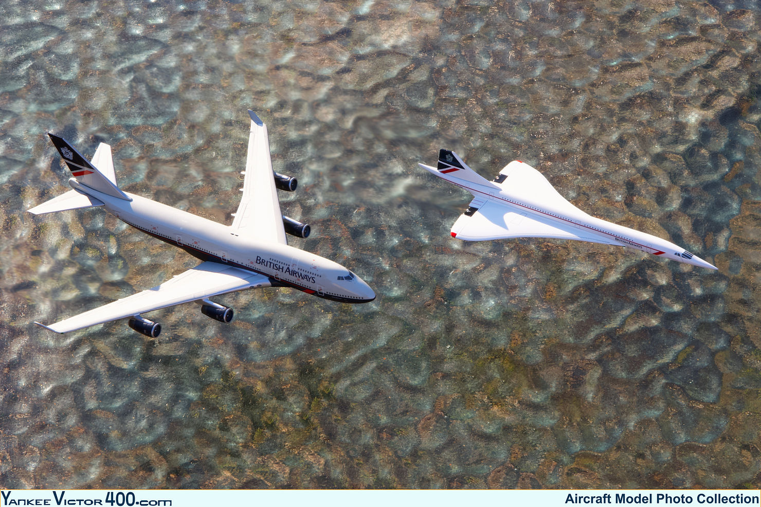
British Airways Boeing 747-436 G-CIVI and Aérospatiale/BAC Concorde 102 G-BOAB. In flight staged shot. GeminiJets 1:400
For me, the Landor livery inspired a lot of respect and admiration due to its elegance. But its freshness also made it look approachable and inviting. British Airways’ Landor livery fitted perfectly the image that I had of the United Kingdom as a nation with a long history and a significant influence worldwide. I would not have expected the aircraft of the country’s flag carrier to look any other way. I think Landor did well in creating a corporate image that perfectly encapsulated the essence of the airline and, to me, it will always be the firm’s masterpiece.
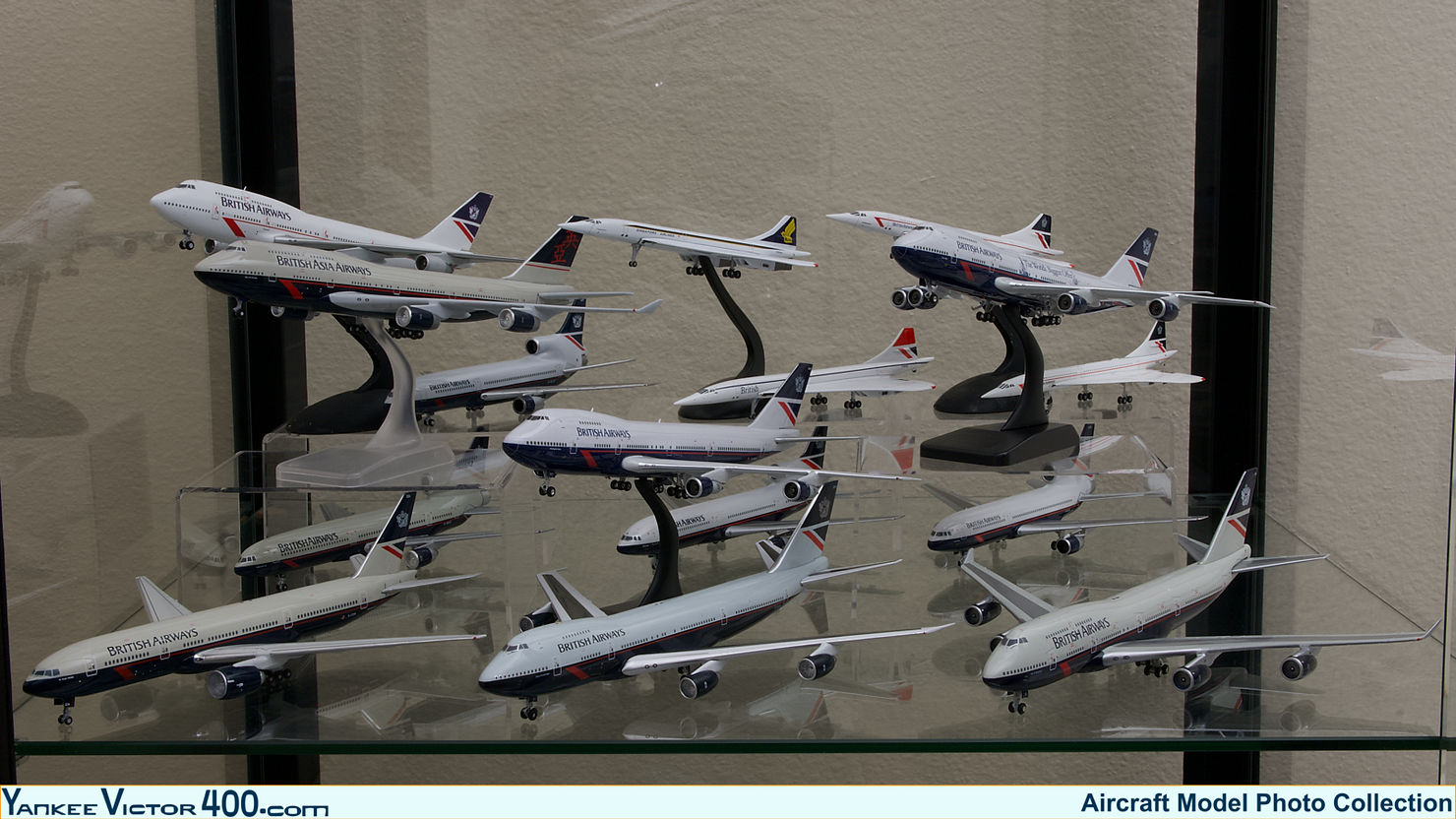
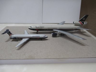
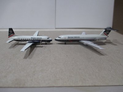
Collection of British Airways Aircraft in the Landor Livery in 1:400 Scale.
On a personal level, one of my first purchases of 2023 put an end to a multi-year hunt for a 1:400 scale British Airways Concorde in the Landor livery (GeminiJets G-BOAB). And as if that wasn’t enough, a few months later I found the only other BA Landor Concorde in 1:400 scale (Herpa G-BOAE).

British Airways Aérospatiale/BAC Concorde 102. Left - GeminiJets G-BOAB. Right - Herpa G-BOAE
With all this happening I think it is a good time to share my thoughts on why the British Airways Landor livery is liked so much by many.
His name was Walter Landor, a genius of corporate branding and the creator of Landor Associates (today Landor & Fitch). The company is behind some of the most iconic corporate images around the world. In the commercial aviation industry dozens of flag carriers ow their public image to Landor. But among all of the airlines that have, or have had, the name Landor attached to their liveries and corporate images, British Airways is probably the one that stands out the most.
In 1984 British Airways as we know it today was only ten years old, though its roots can be traced back for about a century, and it was then when the airline resourced to Landor associates in search of a new corporate image.
A few years later, in February 1987 (only a few months before I was born) the airline was privatized, and a rapid growth campaign that was already underway intensified. As a result, I grew up during a time in which British Airways was doing the same and proudly displaying its eye-catching Landor livery and corporate image.
British Airways' Landor livery consisted of a midnight blue belly that extend right up to the bottom of the passenger windows line, where it met with a pearl grey that covered the entire top of the fuselage. Along the midnight blue belly ran a long subtle “brilliant red” line that culminated on the lower forward fuselage with the Speedwing logo. The company titles were located on the upper forward fuselage, just above the passenger windows. The tail design consisted of a quarter of the Union flag with the British Airways Coat of Arms prominently displayed on the top section of it.

British Airways Lockheed L1011-200 TriStar G-BHBR NG Models 1:400
In spite of the rather dull pearl grey top cover, the contrast with the midnight blue belly, and the accent given by the brilliant red of the Speedwing gave a fresh and lively touch to the otherwise profoundly elegant livery.
The livery seemed to have been tailored for the 747. The aircraft’s main deck window line position in relation to the nose cone was such that the split between the blue belly and grey top cut right through the middle of the radome, making the livery look particularly sharp when applied to the jumbos. The British Airways titles stood prominently, framed by the enlarged forward fuselage area resulting from the jumbo’s upper deck. The livery looked its best on the 747-400, whose longer upper deck allowed the titles to be enlarged.

British Airways Boeing 747-136 G-AWNP Phoenix Models 1:400

British Airways Boeing 747-436 G-CIVI GeminiJets 1:400
The livery was also well suited for other widebody aircraft, though I have always thought that the #2 engine of the DC-10s did get in the way of the tail artwork. On narrowbody aircraft, while still stylish, the livery didn’t always fit as neatly as it did on the big boys, particularly the 747s.
An exception to this is, of course, Concorde, which due to technical reasons had to wear a mostly white adaptation of the livery that suited the aircraft perfectly. It is by far the best attire that Concorde ever wore.

British Airways Aérospatiale/BAC Concorde 102C G-BOAE Herpa 1:400
Luckily, those of us outside of Europe were mostly exposed to British Airways' long-haul fleet, which meant that we got used to seeing the Landor livery displayed on the aircraft on which it tended to look its best! Sadly, in 1997 British Airways started to phase out the Landor livery with the introduction of the Utopia World Tails and eventually standardized the fleet with the Chatham Dockyard artwork, which was one of the World Tails designs of the Utopia campaign. The Chatham Dockyard livery is not ugly, but I find it underwhelming and fails to stand out in the same way the Landor livery did.

British Airways Boeing 747-436 G-CIVI and Aérospatiale/BAC Concorde 102 G-BOAB. In flight staged shot. GeminiJets 1:400
For me, the Landor livery inspired a lot of respect and admiration due to its elegance. But its freshness also made it look approachable and inviting. British Airways’ Landor livery fitted perfectly the image that I had of the United Kingdom as a nation with a long history and a significant influence worldwide. I would not have expected the aircraft of the country’s flag carrier to look any other way. I think Landor did well in creating a corporate image that perfectly encapsulated the essence of the airline and, to me, it will always be the firm’s masterpiece.

Collection of British Airways Aircraft in the Landor Livery in 1:400 Scale.

