50 shades of… blue?

Eagle

Member
Hi all, I notice a lot of discussions about the best moulds but not a whole lot about the liveries/colors. When I see a model the first thing that stands out to me is the paint job - interestingly enough there are quite a lot of variations from different manufacturers or even the same manufacturer for the same livery. Hence here my question - who did represent the true airplane colors the best?

For the new Lufthansa livery I got here 2 Aviation 400 models side to side. Interestingly 2 completely different colors were used (there goes my idea to keep variation down by staying with the same manufacturer lol). I find the 787 too dark and the 350 too bright - still have not found the one for me.
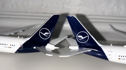
 

Attachments

  • IMG_3956.jpeg
    IMG_3956.jpeg
    198.5 KB · Views: 19
I believe Lufthansa did change the shade of blue they were using on the livery at one point. There was some noise made about the blue not being liked so LH updated the shade in the livery’s early years.

Even still there’s always those slight variations on color on other models. American Airlines is the biggest example; Gemini Jets has used countless shades of gray for their releases. The widebody releases are usually the best, whereas mainline has seen some struggles in the past. Regional jets typically do okay.
They did indeed change. The first 747-8 (D-ABYA) colored had the version that was deemed too dark and the first 747-400 (D-ABVM) the version that was then chosen (brighter) per my understanding. Interestingly enough both models above are supposed to represent the final colors - hence the variation is still odd. This site here usually has a good overview what plane wears what colors - down to the shade of blue. https://sites.google.com/view/europeanairlinefleets/dlh/lhdlh
 
Last edited:
Even still there’s always those slight variations on color on other models. American Airlines is the biggest example; Gemini Jets has used countless shades of gray for their releases. The widebody releases are usually the best, whereas mainline has seen some struggles in the past. Regional jets typically do okay.
KLM is a good example too. Especially GJ and Phoenix use very different shades of blue, meaning that if you have both in your collection, it looks really wrong
 
Another one that stood out to me was the Qatar livery. My first model was the first ever delivered A350-900 (A7-ALA) from PHX. When GJ released the first ever delivered A350-1000 (A7-ANA) I did not hesitate to buy but did not like the GJ paint.
PHX seems to use more a bluish-gray that I feel best represents the planes I have seen - so I ended up buying only PHX versions.
 
Jetstar is another example of a tricky colour/texture to get right. Phoenix’s colour is too dark, and a bit too glossy. NG’s is the closest but still too light.
 
United Battleship Gray
KLM
American (current colors)
Southwest
Saudia
Qatar Airways

these are some examples of liveries with lots of shades variations from the manufacturers. Some get it quite right, while some others really don't
The southwest desert gold retro has a lot of shade variations.
 
BA Landor is another one, even releases by the same manufacturer (GJ) have a different shade of pearl grey.

Aeroclassics has also used what seems to be a different shade of orange/red for each Avianca release.
 
I believe Lufthansa did change the shade of blue they were using on the livery at one point. There was some noise made about the blue not being liked so LH updated the shade in the livery’s early years.

...
Yes, but it's D-AIXI that would need the darker shade. 787s got the lighter blue.
 
Hainan Airlines is another one. Aeroclassics, Aviation400, JC Wings and NG Models use a medium red while the Phoenix colour is a lot lighter (more orange).
 
New York Air has a few shades of red. Most manufacturers who have made New York Air get the general color right, But there are slight differences with each.

I also believe united blue tulip has had a few variations. but nothing too major.
 
Good catch - that makes it even stranger with the D-AIXI being the bright one and D-ABPA being the darker shade model.
Looking at the two tails I asume there were two errors made:
The A350 looks good for the current livery and logo, but D-AIXI is the wrong reg for it. XI was the first to be painted in the new colors, but received the early dark version/logo. I expect it to be repainted into current colors by 2024 maybe.
The 789 seems to have the same artwork but with darker blue for whatever reason.

Btw, here' s a nice picture showcasing 50 years of LH colors:
- the last one is D-ABYT in (retro) 1970's colors - different yellow, blue and artwork
- YD and YI in foreground are 1989-2018 colors and artwork
- the 2nd from behind is YA - prototype for the failed 2018 "dark" blue livery and artwork (= D-AIXI livery)
- A380 D-AIMB carries current colors: a slightly lighter shade of blue but also and updated, larger and bolder crane and circle (= D-ABPA livery)
 
KLM is a good example too. Especially GJ and Phoenix use very different shades of blue, meaning that if you have both in your collection, it looks really wrong
My Gemini Jets KLM 747-400 cargo will be replaced in the future for this reason. All other brands look ok next to each other in terms of the blue colour, but the gemini jets is sort of a light blue.
 
Top