Ng models March 2025 Release Hints

Last edited:
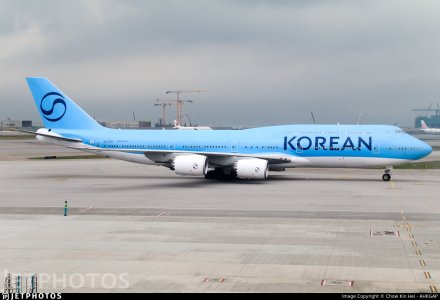
Oh man. Maybe they can get away with this livery on a 787 or 777, but it does not belong on the 74. Some things just shouldn’t change, and the Korean Pepsi livery was one of them.
I will agree. It will even work on the A350-with the added colour on the winglets.

But NOT on the 748.

The 'KOREAN' works on a fuselage of constant height. Not in this case though.
 
I will agree. It will even work on the A350-with the added colour on the winglets.

But NOT on the 748.

The 'KOREAN' works on a fuselage of constant height. Not in this case though.
There are too few elements, so it looks ā€œemptyā€ on a VLA with tons of space. A silver cheatline or some red would’ve made it miles better…
 
There are too few elements, so it looks ā€œemptyā€ on a VLA with tons of space. A silver cheatline or some red would’ve made it miles better…
Right. Absolutely.
Actually, just like I miss the yellow on LH, I will miss the red on here. That little contrast or foil was needed I'll agree.

Or, taking a leaf out of LH's, positioning the titles further up may have helped somewhat?

I now recall, that the designers tested their livery options on the 787 - so clearly it meant that the twin decks may not have been tested upon? Curious how it'll appear on the A380.
 
Or, taking a leaf out of LH's, positioning the titles further up may have helped somewhat?
Shrinking the titles and placing them up higher would definitely look better. I’ve always thought huge billboard titles look cheap.

I now recall, that the designers tested their livery options on the 787 - so clearly it meant that the twin decks may not have been tested upon? Curious how it'll appear on the A380.
Definitely looks like that’s the case. I guess they didn’t bother since the quads will be retired within the next 6 years.
 
I’ve always thought huge billboard titles look cheap.
Right! LCC vibes.
And also why PAs then-bold move does not look too great in hindsight.

Which is why I dislike the new Icelandair and Air India - I do like the concept of the Aurora Borealis colours on the former but not perhaps its execution - on the the latter, it's a garish and poorly developed mash up overall.
 
Shrinking the titles and placing them up higher would definitely look better. I’ve always thought huge billboard titles look cheap.


Definitely looks like that’s the case. I guess they didn’t bother since the quads will be retired within the next 6 years.
Though going by observing other airlines - these quads may hopefully end up being around for longer.
 
Top