This month was a rarity in that I didn't buy any of the Aeroclassics releases, but last month I picked up four including a pair of CO DC-10s. It is somewhat surprising that it has taken so long for them to make Globe scheme Tens, but with four versions in the past two months they are now well covered. Considering the unusual nature of this split scheme aircraft it seemed like a good candidate for a closer look with a review:


Continental Airlines | McDonnell Douglas DC-10-30 | N68060 | Aeroclassics
The Continental globe scheme has become a rather iconic livery, so it is surprising that it has taken until late 2024 for Aeroclassics to release it on a DC-10, with the only previous releases being from Dragon, in 2001, and Gemini, in 2004. Split half an
www.yesterdaysairlines.com

 I have no issues with the AC DC-10 gears. They're underdetailed for today's standards but I'm ok with them lol
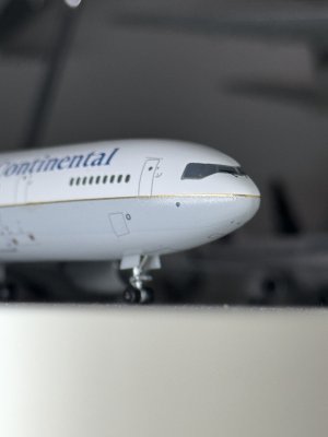

")


 , but more about the basic artwork on which both seem to have a "good enough" approach. And yes, it is usually just that. But I can't help, my eyes keep telling me the Saul Bass titles on the Uniteds isn't correct. The curvature radii of the letters "U", "E" and "D" in the artwork are relatively constant, while in the original Saul Bass, they are exactly not. Yes, I know, this is nitpicking way over the top...