NG B747-8 Lufthansa Retro - Pictures

LeoMuse747

Well-known member
Hello!
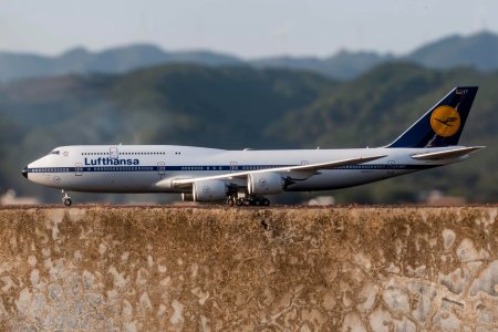
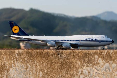
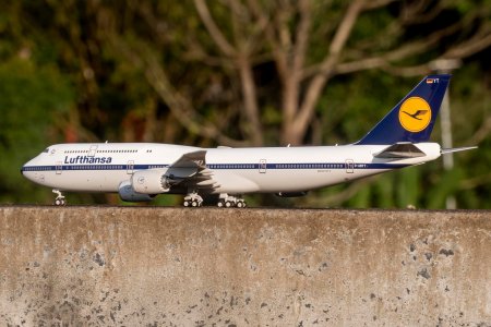
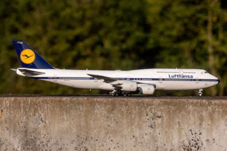
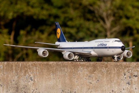
A member of Facebook group "1:400 Scale Model Aircraft World", named Joseph Van, posted some very nice pictures of the Lufthansa Retrojet D-ABYT model, recently released by NG. Some members here on this forum were quite upset about the model, specially due to the cockpit windows. These pictures are very nice and might help us taking a closer look at the model and the details. By the way, all these pictures were taken by Joseph Van, who kindly let me post them here.
1707700811082.jpeg

1707700825611.jpeg

1707700835913.jpeg

1707700845442.jpeg

1707700853964.jpeg

1707700861811.jpeg

Many people complain about the cockpit windows being too big.
I also agree, but now it seems to me that the main problem are the two front windows. They seem to go down the nose way too much.

Pic #4 (from top to bottom) caught my attention because, in this side-on angle, the two front cockpit windows cannot be seen. The cockpit window placement looks great to me on this pic. I can't say the same about pic #2 because it's possible to see how low the front windows go down on the nose section.

Any thoughts?
I think the model looks really great and is the best B747-8 in 1:400 by far, but the cockpit windows could be improved for sure.
 
Hello!
A member of Facebook group "1:400 Scale Model Aircraft World", named Joseph Van, posted some very nice pictures of the Lufthansa Retrojet D-ABYT model, recently released by NG. Some members here on this forum were quite upset about the model, specially due to the cockpit windows. These pictures are very nice and might help us taking a closer look at the model and the details. By the way, all these pictures were taken by Joseph Van, who kindly let me post them here.
View attachment 27473

View attachment 27474

View attachment 27475

View attachment 27476

View attachment 27477

View attachment 27478

Many people complain about the cockpit windows being too big.
I also agree, but now it seems to me that the main problem are the two front windows. They seem to go down the nose way too much.

Pic #4 (from top to bottom) caught my attention because, in this side-on angle, the two front cockpit windows cannot be seen. The cockpit window placement looks great to me on this pic. I can't say the same about pic #2 because it's possible to see how low the front windows go down on the nose section.

Any thoughts?
I think the model looks really great and is the best B747-8 in 1:400 by far, but the cockpit windows could be improved for sure.
I honestly think everything else makes up for it for sure. That lighting and backdrop is amazing too!
 
Nice pictures with a great setup there.

As much as I love NG's quality, this models tail layout just isn't Lufthansa. Sorry.
I posted about these (pre-prod.) artwork errors on the forum hoping NG would take note. Failed.
With the upcoming D-ABYM they show simmilar artwork issues. This time I contacted them directly. Curious whether they get it corrected. I might drop them more mails then😅

My pics of YT once it arrives - which is usually 1-2 weeks late.
 
Last edited:
Hello!
A member of Facebook group "1:400 Scale Model Aircraft World", named Joseph Van, posted some very nice pictures of the Lufthansa Retrojet D-ABYT model, recently released by NG. Some members here on this forum were quite upset about the model, specially due to the cockpit windows. These pictures are very nice and might help us taking a closer look at the model and the details. By the way, all these pictures were taken by Joseph Van, who kindly let me post them here.
View attachment 27473

View attachment 27474

View attachment 27475

View attachment 27476

View attachment 27477

View attachment 27478

Many people complain about the cockpit windows being too big.
I also agree, but now it seems to me that the main problem are the two front windows. They seem to go down the nose way too much.

Pic #4 (from top to bottom) caught my attention because, in this side-on angle, the two front cockpit windows cannot be seen. The cockpit window placement looks great to me on this pic. I can't say the same about pic #2 because it's possible to see how low the front windows go down on the nose section.

Any thoughts?
I think the model looks really great and is the best B747-8 in 1:400 by far, but the cockpit windows could be improved for sure.
I agree with you. The model looks beautiful on these pictures but the two front cockpit windows are too big and go down too low.
 
These pictures make me really, really happy. It's almost a KO.
Realism at its finest. This is what 1:400 is about in 2024.

On the base template, they just need to get the front cockpit windows right
On the LH template the omelette position
 
Hello!
A member of Facebook group "1:400 Scale Model Aircraft World", named Joseph Van, posted some very nice pictures of the Lufthansa Retrojet D-ABYT model, recently released by NG. Some members here on this forum were quite upset about the model, specially due to the cockpit windows. These pictures are very nice and might help us taking a closer look at the model and the details. By the way, all these pictures were taken by Joseph Van, who kindly let me post them here.
View attachment 27473

View attachment 27474

View attachment 27475

View attachment 27476

View attachment 27477

View attachment 27478

Many people complain about the cockpit windows being too big.
I also agree, but now it seems to me that the main problem are the two front windows. They seem to go down the nose way too much.

Pic #4 (from top to bottom) caught my attention because, in this side-on angle, the two front cockpit windows cannot be seen. The cockpit window placement looks great to me on this pic. I can't say the same about pic #2 because it's possible to see how low the front windows go down on the nose section.

Any thoughts?
I think the model looks really great and is the best B747-8 in 1:400 by far, but the cockpit windows could be improved for sure.
I agree with you as well - both on the too big cockpit windows and your general evaluation of the model.

When I saw first pictures, I was a bit sad because of the windows but still decided to pre-order this one and also the N863GT from Atlas Air because I think these two 747s are absolute must-haves in any collection. And as you said, all in all NG pretty much sets the quality standard (next to AV400) and there’s no clue today if or when we get better versions of these epic planes.

Long story short: I‘ll live with the windows and I‘m really looking forward to having these planes soon as well. 😊
 
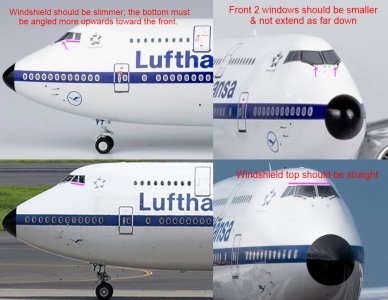
I thought the cockpit windows were too stubby horizontally, but the issue seems to be that the bottom isn't angled upward enough. Besides that, the front two windows shouldn't extend as far down, and the windshield top must be straight.

I made this diagram to illustrate the issues, and will email it to NG tonight.
1708250565358.jpeg
 
Last edited:
I thought the cockpit windows were too stubby horizontally, but the issue seems to be that the bottom isn't angled upward enough. Besides that, the front two windows shouldn't extend as far down, and the windshield top must be straight.

I made this diagram to illustrate the issues, and will email it to NG tonight.
View attachment 27607


That's fantastic, thanks for your effort. Hope NG will finally take note at some point!
 
I thought the cockpit windows were too stubby horizontally, but the issue seems to be that the bottom isn't angled upward enough. Besides that, the front two windows shouldn't extend as far down, and the windshield top must be straight.

I made this diagram to illustrate the issues, and will email it to NG tonight.
View attachment 27607
Hopefully NG will be able to rectify this, and without it ending up altering / affecting the rest of the template - that seems pretty spot on.
 
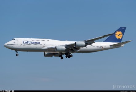
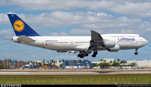
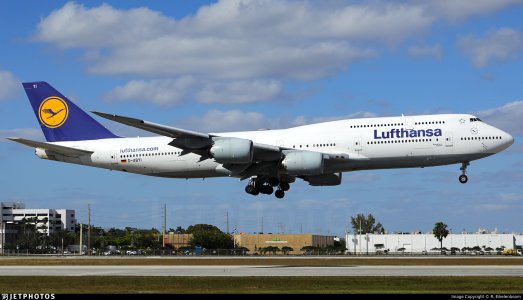
I hope NG will not get the colors wrong on their next Lufthansa 747-8i.

For this livery, the grey belly is little green/blue ans the tail logo is a little orange (more than the D-ABYT one) but pictures say more than thousands of words…

IMG_5432.jpegIMG_5429.jpegIMG_5433.jpegIMG_5435.jpegIMG_5436.jpegIMG_5437.jpeg
 
I thought the cockpit windows were too stubby horizontally, but the issue seems to be that the bottom isn't angled upward enough. Besides that, the front two windows shouldn't extend as far down, and the windshield top must be straight.

I made this diagram to illustrate the issues, and will email it to NG tonight.
View attachment 27607
Besides the already discussed issues with the cockpit windows and belly colors for me the Lufthansa Titles are too bold. Furthermore the emergency door of the upper deck has the wrong shape. Its too wide.
 
I hope NG will not get the colors wrong on their next Lufthansa 747-8i.

For this livery, the grey belly is little green/blue ans the tail logo is a little orange (more than the D-ABYT one) but pictures say more than thousands of words…

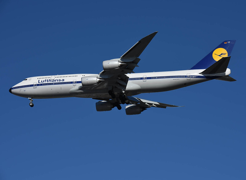
I refrained from commenting colors on this so far as I want to hold it in hands first, but I'd strongly believe that NG used what looks like 1990's (1989-2017) colors instead of the earlier less saturated collors YT should be in. So in consequence I think if they do YM in these colors they are good.

Here's a nice pic showing not less than 4 tail colors (liveries) side by side
From front to back:
- 1989-2017
- current
- 2018
- 1970's (Retro)
 
Last edited:
I refrained from commenting colors on this so far as I want to hold it in hands first, but I'd strongly believe that NG used what looks like 1990's (1989-2017) colors instead of the earlier less saturated collors YT should be in. So in consequence I think if they do YM in these colors they are good.

Here's a nice pic showing not less than 4 tail colors (liveries) side by side
From front to back:
- 1989-2017
- current
- 2018
- 1970's (Retro)
Thanks! This is such a stunning photo capturing all the variations in one frame.

Looking forward to your insights when you get your copy of YT in hand.
 
Last edited:
Top