You are using an out of date browser. It may not display this or other websites correctly.
You should upgrade or use an alternative browser.
You should upgrade or use an alternative browser.
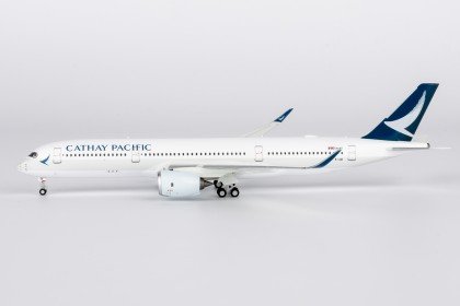
Cathay Pacific green is.....actually grey!!
- Thread starter planes_on_a_shelf
- Start date


pons399
Well-known member
It’s green, Cathay’s official merch has it green. Looks gray under certain lighting conditions, but clearly the same color as the engines.Some recent releases from multiple brands
AeroPolaris / HYJL
View attachment 66046
View attachment 66045
Phoenix
View attachment 66047
View attachment 66048
JC Wings
View attachment 66049
View attachment 66050
And NG of course - the most or only discussed one - for reasons best known to the universe
View attachment 66052


You guys make me laugh and the conversations around this especially make me smile.
Cathay Pacific themselves clearly don't think it is green!!!

and from the Cathay brand guidelines themselves:

Cathay Pacific themselves clearly don't think it is green!!!
and from the Cathay brand guidelines themselves:
Macsergey
Member
Despite it is called grey, the color is not neutral grey, it has less red then green and blue, so it is greenish-bluish greyCathay Pacific themselves clearly don't think it is green!!!

Cathay themselves are saying the colour is PMS 5455, which works out to be #c7d7e0 RGB 199:215:224Despite it is called grey, the color is not neutral grey, it has less red then green and blue, so it is greenish-bluish grey
View attachment 66077

qweyrhgf
Well-known member
I think that's the crux of the problem. According to the official website, the correct color is gray. But, everyone knows that the color in reality is mostly green.You guys make me laugh and the conversations around this especially make me smile.
Cathay Pacific themselves clearly don't think it is green!!!
View attachment 66070
and from the Cathay brand guidelines themselves:
View attachment 66072


The colors used by manufacturers and on their official websites will appear different from reality.So this also explains why the manufacturer used the wrong color.
Macsergey
Member
the color is definitely bluish according to the CMYK values, but it might be some brain trick what makes it look greenish instead of bluish due to another dark green color is used, also a human eye is more sensitive to green what might also affect thisI'm confused. What color are we talking about? The only green I see is the tail/titles. Stripes/engines are best described as a pale sky blue. That's also what the CMYK in the design guide suggests: 5,0,0,10.
Yes, technically this is still a "grey".
planes_on_a_shelf
Well-known member
I'm happy I (finally) made this thread that I've been thinking of for a while
Thread title edited accordingly
Thread title edited accordingly
Phantom
Well-known member
Dealing with this almost daily (just now had a cold light grey that appeared antique pink on its pale turquise base) and yes, this happens frequently.but it might be some brain trick what makes it look greenish instead of bluish due to another dark green color is used, also a human eye is more sensitive to green what might also affect this
In case of jpegs, such "off greys" often confuse the auto white balance in images.
DTcustoms
Well-known member
Reminds me of when people were discussing about the A350 wings colorDealing with this almost daily (just now had a cold light grey that appeared antique pink on its pale turquise base) and yes, this happens frequently.
In case of jpegs, such "off greys" often confuse the auto white balance in images.
JJ Skippy
Well-known member
Honestly - as long as it's not egregiously off (which to me most seem pretty acceptable) I don't mind. Seems like this color is another one of those that manufacturers have some variety in, though this one doesn't seem as bad as the American mica paint or the United Battleship Gray.
Phantom
Well-known member
The problem here is the variety on one and the same model.Honestly - as long as it's not egregiously off (which to me most seem pretty acceptable) I don't mind. Seems like this color is another one of those that manufacturers have some variety in, though this one doesn't seem as bad as the American mica paint or the United Battleship Gray.
nat_hat
Member
Phoenix
View attachment 66047
View attachment 66048
And NG of course - the most or only discussed one - for reasons best known to the universe
View attachment 66052
Maybe it is grey rather than green (for me I think the recent Phoenix rendition looks close enough), but if so it is definitely not as light a grey as the NG photos show.
planes_on_a_shelf
Well-known member
Right.The problem here is the variety on one and the same model.
That all of the above examples, barring may be the one 748F, possess.
And as long as a manufacturer doesn't keep altering between their own releases - that we see say between the two 748Fs
JJ Skippy
Well-known member
That I can understand - manufacturers should be able to stay consistent with the color. I still remember the debacle with all the different shades of American's livery.The problem here is the variety on one and the same model.
bakejobb_23
Well-known member
so is the dress black and blue or white and gold…?
TrijetBlast
Member
Here's a design question to anyone who's familiar or in the industry:
Do airlines use Pantone, CMYK, RGB or HEX when they mix the actual paint? How do they transfer print color swatches to actual paint? Does actual paint have a color swatch library based off from Pantone, CMYK, HEX or RGB?
To me, RGB is more like a screen color and just like HEX it's for digital design or web but paint is a total different medium.
I always curious how close of actual paint color to match up with the screen color they look at on a monitor of a color swatch
Phantom
Well-known member
These are all different systems.Here's a design question to anyone who's familiar or in the industry:
Do airlines use Pantone, CMYK, RGB or HEX when they mix the actual paint? How do they transfer print color swatches to actual paint? Does actual paint have a color swatch library based off from Pantone, CMYK, HEX or RGB?
To me, RGB is more like a screen color and just like HEX it's for digital design or web but paint is a total different medium.
I always curious how close of actual paint color to match up with the screen color they look at on a monitor of a color swatch View attachment 66096
HEX and RGB are all digital while Pantone/RAL is usually used as a design reference (prototyoing, product, print), printers print process colors based on CMYK(+) and there's aero specific systems. For decades the worldwide "standard" in the airline business was the BAC system by Boeing. But there are other systems (Airbus, ATR...) as well today.
So when a new design is set up, this can be done based on RAL for example, design guides translate this for the digital world (RGB, HEX..) and aero coatings either get customised or existing "close" tones are selected. RAL 7001 for example can be painted using BAC 708 grey on an aircraft for example as these are close matches.
Last edited:
Similar threads
- Replies
- 25
- Views
- 689
- Replies
- 37
- Views
- 1K
- Replies
- 11
- Views
- 1K